Lit From Within: 10 Video Games That Turned Neon Into a Serious Art Form
Here's an argument worth making out loud: video games are among the most ambitious and most overlooked venues for serious visual art in the United States right now. While the fine art world debates whether digital work belongs in galleries, game designers have been quietly constructing some of the most sophisticated neon-lit visual environments ever conceived — entire cities, entire futures, built entirely from light and intention.
Neon in games isn't just an aesthetic shortcut. When it's done right, it's a complete design philosophy. It shapes mood, communicates world-building, guides the player's eye, and tells you something true about the society being depicted. The 10 games below didn't just use neon. They made it mean something.
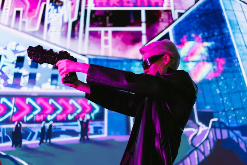
1. Cyberpunk 2077 (2020) — CD Projekt Red
No list like this starts anywhere else. Night City is arguably the most fully realized neon-saturated environment ever built in a video game, a sprawling megalopolis where every surface competes for your attention with holographic advertisements, rain-slicked reflections, and color-coded gang territories. The artistic team made deliberate choices about which districts glow in which hues — the corporate Corpo Plaza runs cool blues and whites, while the street-level chaos of Watson burns in aggressive oranges and magentas.
The game's visual language argues, pretty convincingly, that neon is the aesthetic of inequality — the brighter the lights, the deeper the shadows beneath them. That's not decoration. That's design with a point of view.
Design legacy: Directly influenced a wave of UI/UX designers and digital illustrators who adopted its layered, information-dense neon aesthetic for everything from app interfaces to music visualizers.
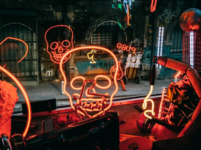
2. Hotline Miami (2012) — Dennaton Games
Few games have weaponized neon as effectively as this top-down fever dream set in a hyper-stylized 1989 Miami. The color palette — electric pinks, acid greens, bruised purples — isn't just visually striking. It's psychologically destabilizing, which is precisely the point. Every level feels like a blacklight poster that's been soaked in adrenaline.
Dennaton Games made the radical choice to keep the art style lo-fi and pixelated while pushing the color saturation to near-painful extremes. The contrast creates a kind of beautiful wrongness that perfectly mirrors the game's themes of violence and unreality.
Design legacy: Hotline Miami became a reference point for an entire generation of indie developers and graphic designers interested in retro-neon aesthetics — its influence is visible in album art, streetwear graphics, and motion design to this day.
3. Transistor (2014) — Supergiant Games
Supergiant's follow-up to Bastion is a masterclass in using neon as emotional storytelling. The city of Cloudbank is rendered in art nouveau curves and electric blues, a place that feels simultaneously elegant and endangered. The neon here isn't loud — it's lyrical, used to create a sense of melancholy beauty rather than sensory overload.
Art director Jen Zee built a visual world where the dying of the light is literally the central narrative metaphor, making every glowing element feel precious and temporary.
Design legacy: Transistor demonstrated that neon aesthetics didn't have to default to aggression or excess — it could be quiet, emotional, and painterly.
4. Tron: Evolution (2010) — Propaganda Games
The Tron universe has always been the purest expression of neon as a foundational design system — a world where light is the architecture. Evolution, the game tie-in to Legacy, extended that vision into interactive space, letting players move through environments where glowing grid lines and electric blues define every surface and structure.
While the game itself received mixed reviews, its visual design was genuinely ambitious — a proof of concept that a neon-only color philosophy could sustain an entire interactive world.
Design legacy: Influenced the visual identity of countless tech brands and digital products throughout the 2010s, proving that the Tron aesthetic had genuine commercial and cultural staying power.
5. Mirror's Edge Catalyst (2016) — DICE
Catalyst made the bold choice to go almost entirely the other direction — a predominantly white, clean city periodically slashed with high-contrast neon red. That restraint makes every moment of color land with enormous visual force. The neon here functions like punctuation, giving the world rhythm and urgency.
The art team's decision to use color as a functional wayfinding system — guiding the player's parkour path through the environment — is one of the most elegant integrations of aesthetics and game design in recent memory.
Design legacy: Became a case study in minimalist neon design, cited by graphic designers and architects interested in using color as a navigational and emotional tool.
6. Va-11 Hall-A (2016) — Sukeban Games
This Venezuelan-developed visual novel, set in a cyberpunk bar, proves that neon world-building doesn't require a massive budget or a sprawling open world. The game's pixel art aesthetic — rain-streaked windows, glowing drink recipes, the warm haze of a dive bar at the end of the world — creates an extraordinarily intimate neon atmosphere.
Va-11 Hall-A argues that neon is fundamentally about warmth as much as brightness — that the glow of a bar sign on a rainy night is as emotionally resonant as any skyscraper-scale light show.
Design legacy: Became a cult touchstone for lo-fi cyberpunk aesthetics and deeply influenced the visual identity of the "cozy cyberpunk" subgenre in both games and digital art.
7. Neon White (2022) — Angel Matrix
The title is basically a mission statement. Neon White uses its visual design to communicate speed and transcendence — the game's card-based combat and parkour movement are rendered in a style where neon trails and color-coded card types create a constantly shifting, kinetic light show.
Every mechanic has a corresponding visual language, making the neon design genuinely functional rather than purely decorative. When you're playing at your best, the screen looks like a fireworks display with a point.
Design legacy: Demonstrated how neon aesthetics could be embedded into game feel itself — not just the world, but the movement through it.
8. Ghostrunner (2020) — One More Level
Set in a brutalist cyberpunk megastructure called Dharma Tower, Ghostrunner deploys neon in a deliberately harsh, industrial register — this isn't the seductive glow of Night City but the harsh fluorescence of a world that has given up on beauty. That distinction is itself a meaningful artistic choice.
The contrast between the tower's cold brutalism and the desperate warmth of its neon-lit slums tells you everything about the world's social structure without a single line of exposition.
Design legacy: Influenced the "brutalist cyberpunk" aesthetic trend in digital art and concept design — neon not as glamour but as the last gasp of humanity in an inhuman environment.
9. Katana ZERO (2019) — Askiisoft
Another entry proving that pixel art and neon are a combination that never gets old. Katana ZERO's 2D environments — rain-soaked streets, neon-lit nightclubs, grimy hotels — are constructed with an almost cinematic attention to atmosphere. The game's neon design pulls heavily from neo-noir film, treating light sources as characters in their own right.
The artistic discipline here is remarkable. Every neon element earns its place in the frame.
Design legacy: Reinforced pixel art's legitimacy as a serious neon design medium, inspiring a generation of independent game developers and digital illustrators.
10. Destiny 2: The Neon Abyss Update / General Aesthetic (Ongoing) — Bungie
Bungie's long-running shooter deserves recognition for the sustained visual ambition of its environmental design — particularly in locations like the Dreaming City and the Witch Queen's throne world, where otherworldly neon palettes create environments that feel genuinely alien and genuinely beautiful.
Destiny 2 proves that neon aesthetics can operate at epic, mythological scale — that electric color can feel sacred rather than synthetic.
Design legacy: Demonstrated that neon-inflected digital art could carry genuine emotional and narrative weight in a mainstream, mass-audience context.
The Gallery Is Open
The argument here isn't subtle: games are a legitimate and seriously underappreciated venue for neon-driven visual artistry. The designers behind these titles made real artistic choices — about color theory, about emotional resonance, about what light means in a constructed world — with the same intentionality as any painter or sculptor.
Next time someone tells you video games aren't art, hand them a controller and point them at Night City at 2 a.m. The neon will do the rest of the arguing.