Electric Type: 10 Neon-Inspired Fonts and the US Designers Making Glowing Letters Cool Again
A great neon sign doesn't just spell something out. It radiates. The letters bloom slightly at the edges, colors bleed into each other, and the whole thing hums with a kind of artificial warmth that no print font has ever quite managed to replicate. For decades, digital typography kind of gave up on capturing that quality — opting for clean vectors and pixel-precise edges instead.
That era is over.
Right now, across design studios, independent foundries, and solo type designers from Brooklyn to Los Angeles, there's a genuine movement to engineer typefaces that carry the electric soul of neon into digital-first contexts. These aren't novelty fonts for Halloween flyers. They're sophisticated, versatile type systems being deployed in serious branding work, streaming UI design, motion graphics, and cultural fashion. Below, we profile 10 standout typefaces and the American designers shaping this glowing corner of visual culture.
1. Neon Tubes — Vintage Type Co. (Los Angeles, CA)
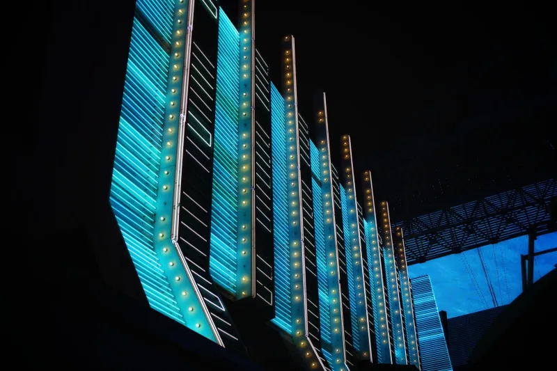
Vintage Type Co. has built a reputation for treating historical American commercial lettering as a legitimate design resource, and Neon Tubes is their most explicitly electric offering. Modeled on the rounded, gas-tube letterforms of mid-century American signage, it captures the slight imprecision of real neon — strokes that swell gently at bends, terminals that echo actual glass tubing.
In practice, Neon Tubes shows up a lot in food and beverage branding, where that diner-nostalgia frequency resonates. But designers have also used it in motion graphics contexts where a retro-warm title card is needed. Pair it with a dark background and a subtle outer glow in After Effects and it's genuinely hard to distinguish from a photograph of actual signage.
Best used for: Brand identity, retro-themed motion graphics, bar and restaurant signage
2. Voltaire Display — House Industries (Wilmington, DE)
House Industries has been one of America's most influential type foundries for decades, and their work consistently demonstrates that display type can be both highly conceptual and practically useful. Voltaire Display leans into a sharp, angular geometry that references the hard-edged neon lettering of Las Vegas casino culture — that specific flavor of American maximalism where every letter wants to be a spectacle.
The font has found significant traction in streetwear contexts. Several independent clothing labels have used Voltaire Display for drop graphics and lookbook headlines, drawn to its ability to feel simultaneously retro and forward-looking. It's also appeared in event branding for electronic music events, where the Vegas-neon heritage feels tonally appropriate.
Best used for: Streetwear, event branding, editorial headlines
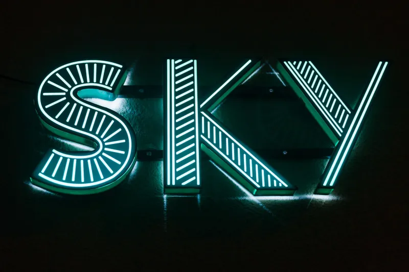
3. Glowfield — Colophon Foundry US (New York, NY)
Colophon's Glowfield is a more restrained take on neon aesthetics — which, paradoxically, might make it more versatile than louder alternatives. The typeface doesn't scream "neon sign" so much as it whispers "something is glowing nearby." Strokes have a slight luminous quality baked into their proportions, and the spacing is calibrated to create a sense of light emanating from between letters.
Glowfield has been used in UI contexts where a premium, tech-forward feel is needed without tipping into full retro-futurist territory. At least one major streaming platform has reportedly used a custom variant of the font in promotional material for sci-fi content, though the specifics remain under NDA.
Best used for: UI design, streaming platform branding, tech product launches
4. CRT Gothic — Erik Marinovich / Friends of Type (San Francisco, CA)
Erik Marinovich is one of the most respected lettering artists working in the US, and his work through the Friends of Type collective consistently pushes at the boundaries of what letterforms can do. CRT Gothic takes its cues not from glass neon tubes but from the phosphorescent glow of cathode-ray tube monitors — that slightly fuzzy, warm-green luminosity that defined early personal computing.
The result is a typeface that feels genuinely nostalgic but not kitschy. It's been used in gaming contexts, in tech brand identities that want to reference the hacker-culture aesthetic, and in editorial design for publications covering digital culture. The slightly irregular stroke weights give it a handmade quality that pure vector fonts often lack.
Best used for: Gaming, tech branding, editorial design, digital culture publications
5. Chromashift — Hoefler&Co. (New York, NY)
Hoefler&Co. occupies a unique position in American type design — they're simultaneously the most institutionally respected foundry in the country and genuinely adventurous designers willing to explore territory that other foundries might consider too niche. Chromashift is their most explicit engagement with neon aesthetics, a typeface built around the phenomenon of chromatic aberration — the slight color fringing that occurs when neon light bleeds at the edges.
Used in its basic form, Chromashift reads as a clean, slightly futurist sans-serif. Layered with its chromatic offset variant, it produces a stunning RGB-split effect that looks like a neon sign photographed slightly out of focus. It's been used in high-end fashion editorial and in title card design for prestige television.
Best used for: Fashion editorial, TV title design, premium brand campaigns
6. Lasertag — Mark Simonson Studio (Minneapolis, MN)
Mark Simonson is something of a legend in independent type design, best known for Proxima Nova — one of the most widely used fonts on the internet. Lasertag is a deliberate departure from that utilitarian work: a display typeface that fully embraces the aesthetic of 1980s American pop culture, where neon and laser graphics were everywhere from arcade carpets to album covers.
The font is unabashedly fun, with letterforms that reference both neon tube construction and the angular energy of '80s vector graphics. It's found an enthusiastic audience in the nostalgia-driven corners of brand design, appearing in merchandise for pop culture events and in the kind of retro-themed brand activations that proliferate at music festivals.
Best used for: Event merchandise, retro brand activations, pop culture editorial
7. Ultraviolet Sans — Suitcase Type Foundry US (distributed via MyFonts)
Originally a Czech foundry, Suitcase Type has a significant US distribution presence and a design sensibility that translates well to American visual culture. Ultraviolet Sans is their most neon-adjacent offering — a geometric sans-serif with stroke proportions calibrated to mimic the visual weight of neon tubing, and a set of alternate letterforms that lean into the rounded, glassy quality of bent glass.
Designers working in app UI have gravitated toward Ultraviolet Sans for interfaces where a tech-forward, slightly edgy aesthetic is needed. It's also appeared in the visual identity of several US-based music labels operating in the electronic and hip-hop spaces.
Best used for: App UI, music label identity, digital product design
8. Phosphor — Emigre (Sacramento, CA)
EMigre is one of the foundational institutions of American experimental type design, and their catalog remains a goldmine for designers willing to look beyond the obvious. Phosphor, one of their more recent releases, takes its name from the light-emitting compounds used in CRT screens and early LED displays — and the typeface fully inhabits that reference.
Letters have a slightly bloomed quality, as if rendered on a screen with imperfect contrast. The overall effect is less "neon sign" and more "glowing terminal," which makes it particularly well-suited to design work that wants to evoke hacking culture, sci-fi aesthetics, or the early internet without leaning on cliché.
Best used for: Sci-fi branding, tech editorial, game UI design
9. Nitelife — Latinotype US (distributed via Adobe Fonts)
LatinoType has become one of the most important type foundries serving the US market, and Nitelife is a typeface that feels tailor-made for the American nightlife and entertainment industry. Broad, confident letterforms with slightly flared terminals reference the bold neon signage of American bars and music venues, while the overall construction is clean enough to work in digital contexts without feeling like a costume.
Nitelife has been picked up by several entertainment brands for event marketing, and it's been spotted in the visual identity of US-based festival brands that want a typography solution that bridges print and digital without losing its luminous character.
Best used for: Entertainment branding, festival marketing, nightlife venue identity
10. Glitch Serif — Vocal Type Co. (Washington, DC)
Tré Seals founded Vocal Type Co. with a mission to create typefaces rooted in the history of social movements and underrepresented American design traditions — which makes it a somewhat unexpected entry on a list about neon aesthetics. But Glitch Serif is a genuinely fascinating typeface that merges the chromatic distortion of digital glitch art with the structural warmth of classic serif letterforms.
The result is something that feels both historically grounded and urgently contemporary. Glitch Serif has found significant traction in music and culture editorial, in brand work for Black-owned streetwear labels, and in motion graphics contexts where a typeface that feels alive and slightly unstable is exactly what's needed. It's neon in the truest sense — electric, warm, and impossible to look away from.
Best used for: Music editorial, streetwear, social impact branding, motion graphics
The Bigger Picture
What ties these ten typefaces together isn't just aesthetic — it's a shared conviction that typography can be a vehicle for light, warmth, and energy, not just information. The designers behind these fonts are drawing on a rich American visual tradition (the neon sign, the CRT monitor, the arcade cabinet, the Vegas strip) and translating it into a form that works for the screens, apps, and brand identities of right now.
For designers looking to bring some electric energy into their work, any of these typefaces is a solid starting point. But the real lesson from this corner of type design is broader: letters can glow. They always could. Someone just had to remember to let them.